Bloom Hearing Specialists:
Rebrand
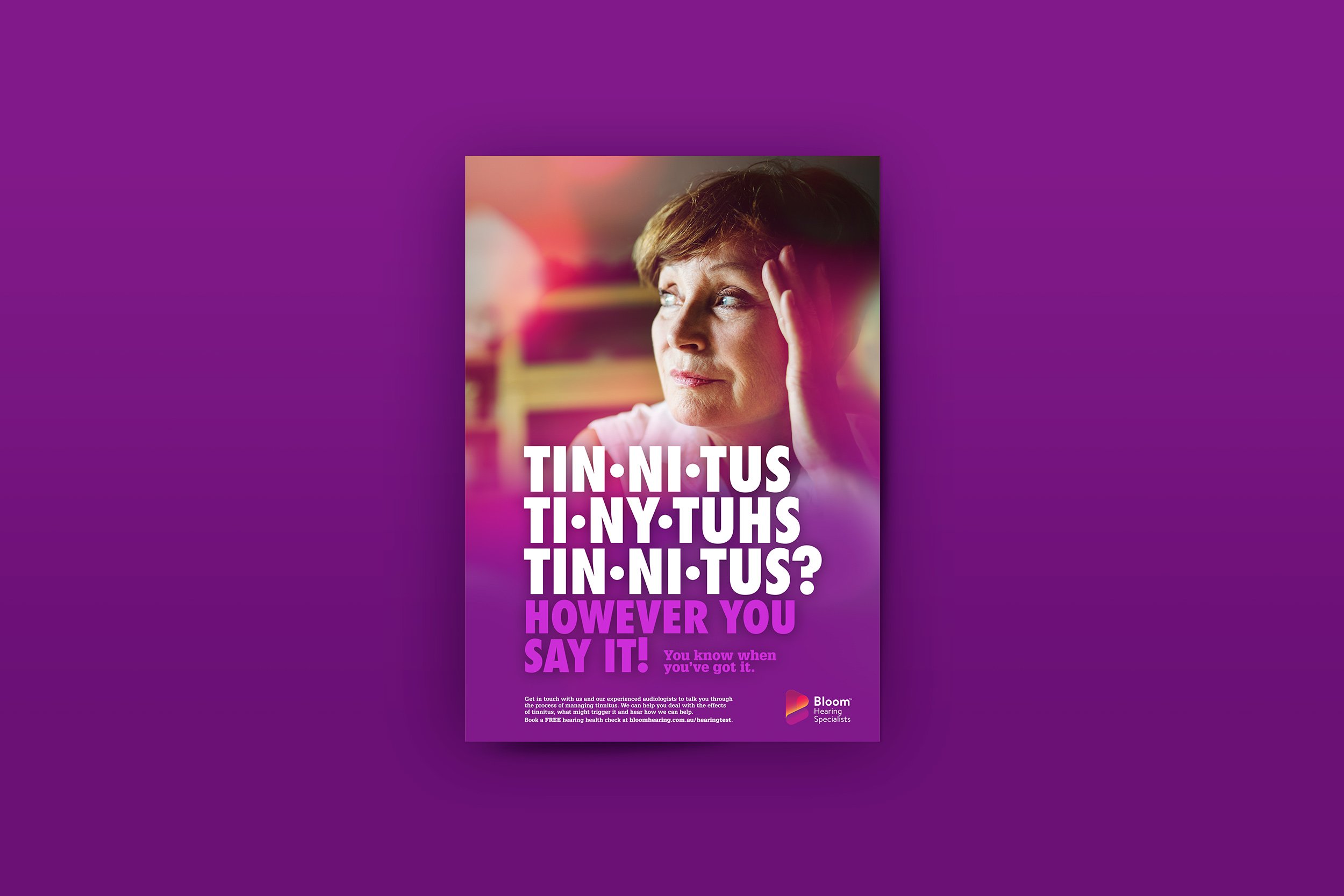
Brief • Revitalize an outdated logo that felt cold and lacked personality, while developing two new campaigns that reinforce the brand’s updated identity.
Solution • A fresh, vibrant rebrand that injects colour, youth, and boldness into the logo. The new logo concepts are designed to drive the right associations with Bloom’s products and services: Bloom = Hearing Specialists + Hearing Aids. The design explores a strong yet fluid style, blending a logo symbol and logo type to create a modern, cohesive identity.
Brand Re-Positioning
• Become younger and more vibrant
• Bold, bright, and full of life
• A brand with a BIG personality
• Improve customer engagement
• Build a greater brand profile
• Be REAL across all messaging
The new look positions Bloom as both industry experts and an approachable, real, and human brand. Messaging is warm, authentic, and confident – showcasing the power of hearing in everyday moments, and inviting people to experience life to the fullest. The campaigns focus on relatable hearing problems, further reinforcing Bloom as the trusted partner in hearing health.