T2
Packaging & Product Projects
T2 Tea’s brand personality is vibrant, playful, and premium. It combines boldness and adventure with a touch of sophistication, offering high-quality, unique blends in an approachable, fun way. The brand is welcoming, celebrating both its local roots and global flair, making tea drinking exciting, inclusive, and stylish.
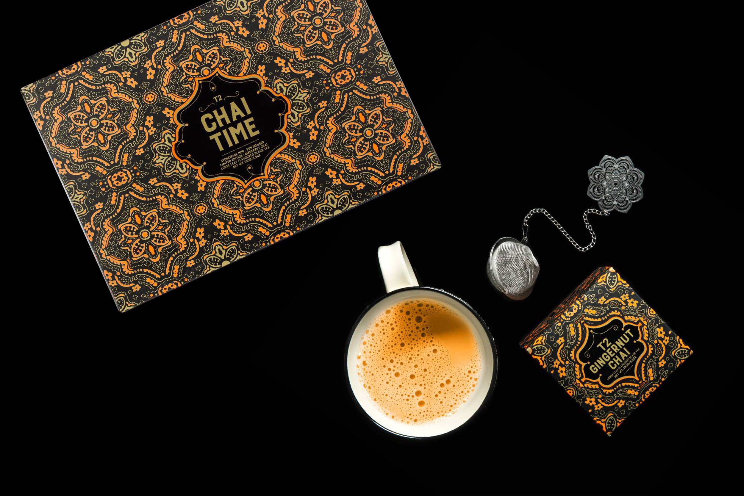
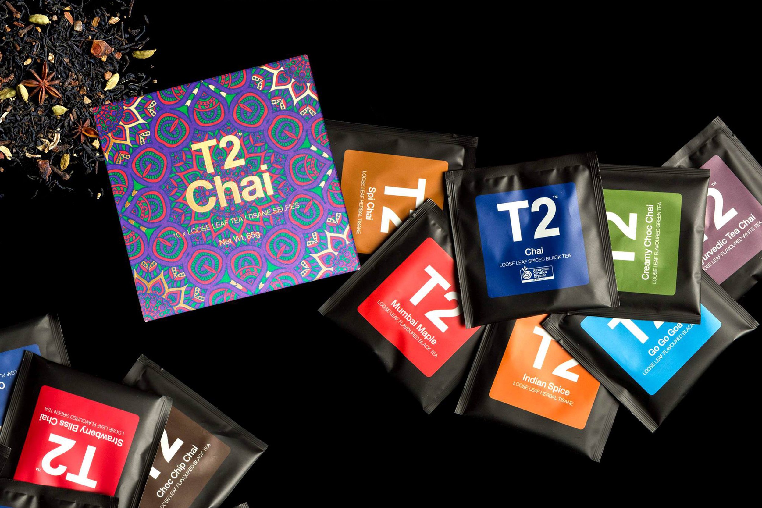
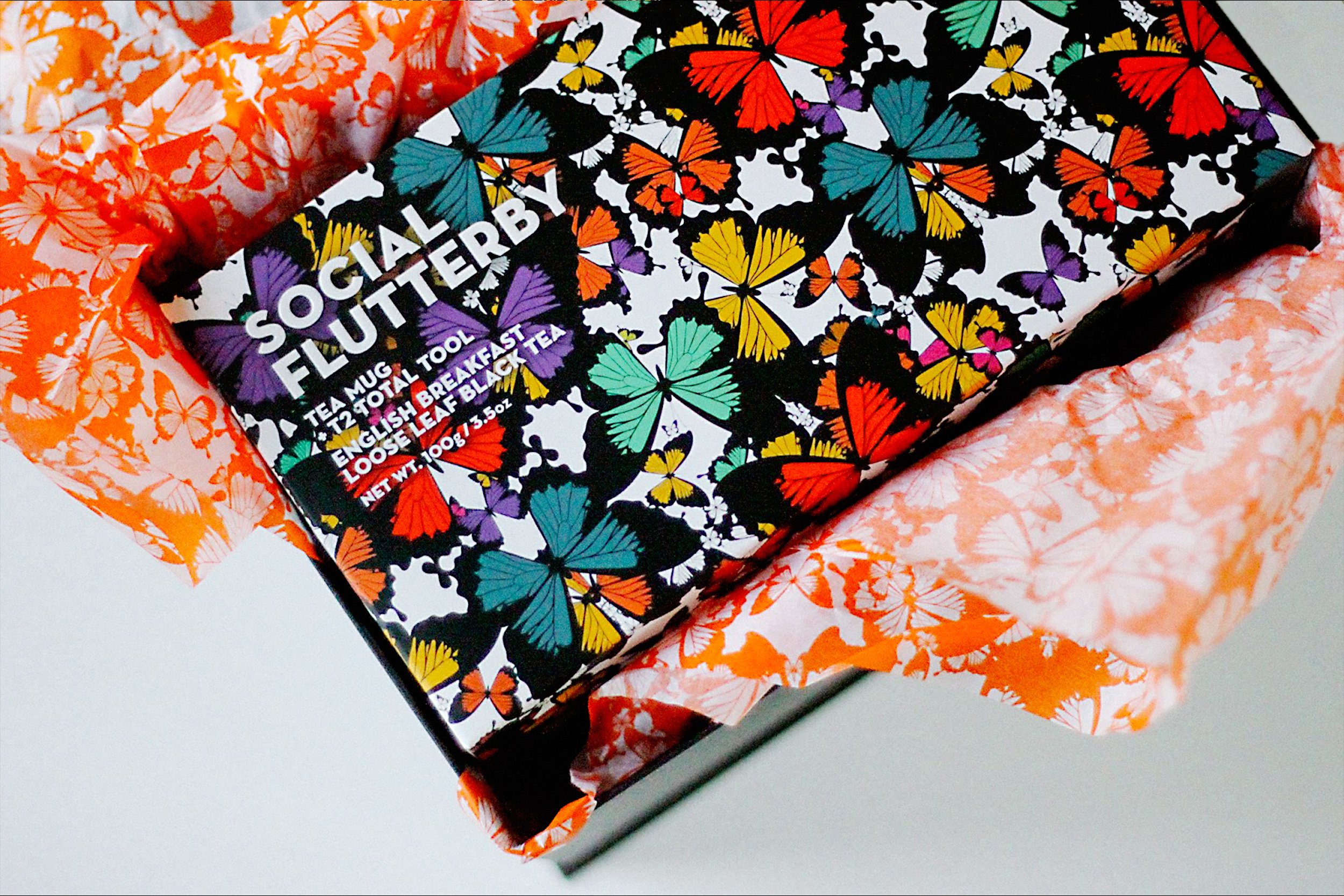
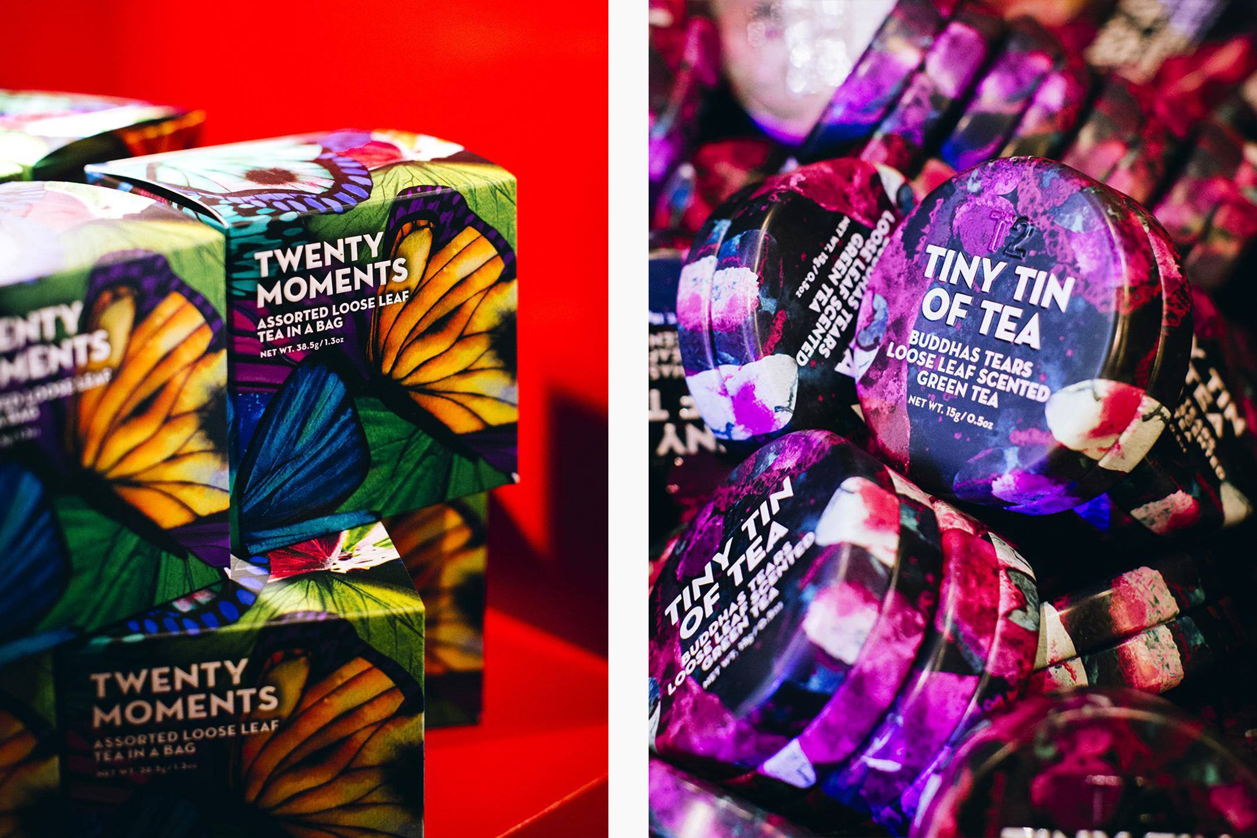
T2 Tea packaging is all about making a statement with its bold, vibrant designs and premium quality. The brand blends modern aesthetics with eye-catching colours and playful graphics to create a standout experience.
This is a range of packaging, wraps, and product decals I’ve created for T2. Here’s a quick breakdown of the key styles that have been applied to the designs:
Bold & Colourful
T2 doesn’t shy away from bright, lively colours and graphic patterns that make the packaging fun and attention-grabbing. It’s about inviting customers to try something new and exciting, reflecting the brand’s adventurous and energetic vibe.
Premium & Refined
Even with its bold approach, T2 maintains a luxurious feel with materials like matte finishes, embossed logos, and foil details. The tea tins, for instance, have a sleek and sophisticated look, giving T2 a high-end but still approachable vibe.
Practical & Functional
T2’s packaging isn’t just pretty—it’s practical too. The resealable pouches keep loose-leaf tea fresh, and the tins and boxes are designed for easy storage and display. The goal is to make the tea experience simple, organised, and a joy to use every day.
T2’s packaging strikes the perfect balance between vibrant design and premium quality, offering a mix of eye-catching style and everyday practicality.
Feature Project:
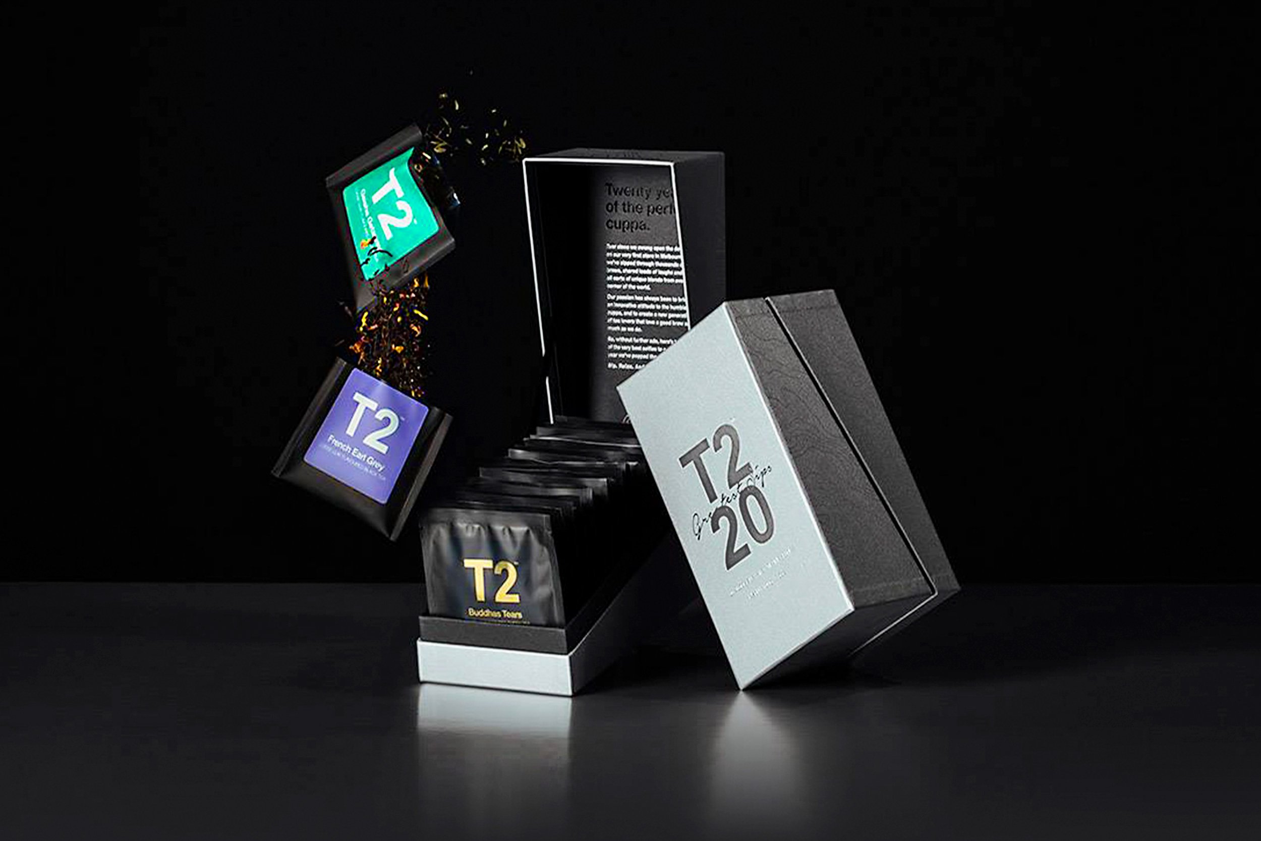
T2 - 20 Greatest Sips
This packaging design celebrates T2's 20th anniversary with a fun, premium design. The box, inspired by their signature tea packaging, is lengthened to hold all 20 pouches. It opens at a sleek black bar, showcasing each flavor in its original pouch.
The packaging features Japanese specialty paper for a luxurious feel, accented with two colored foils and a clear satin varnish that traces Melbourne's topographic lines, adding a local touch. The anniversary logo, ‘T2 20 Greatest Sips’, extends from the brand’s familiar logo with a playful, custom type treatment, making the design feel personal and celebratory.
The overall design merges T2’s heritage with modern flair, making it a beautiful and functional tribute to two decades of tea.