Noble By Noble:
Rebrand & Re-launch
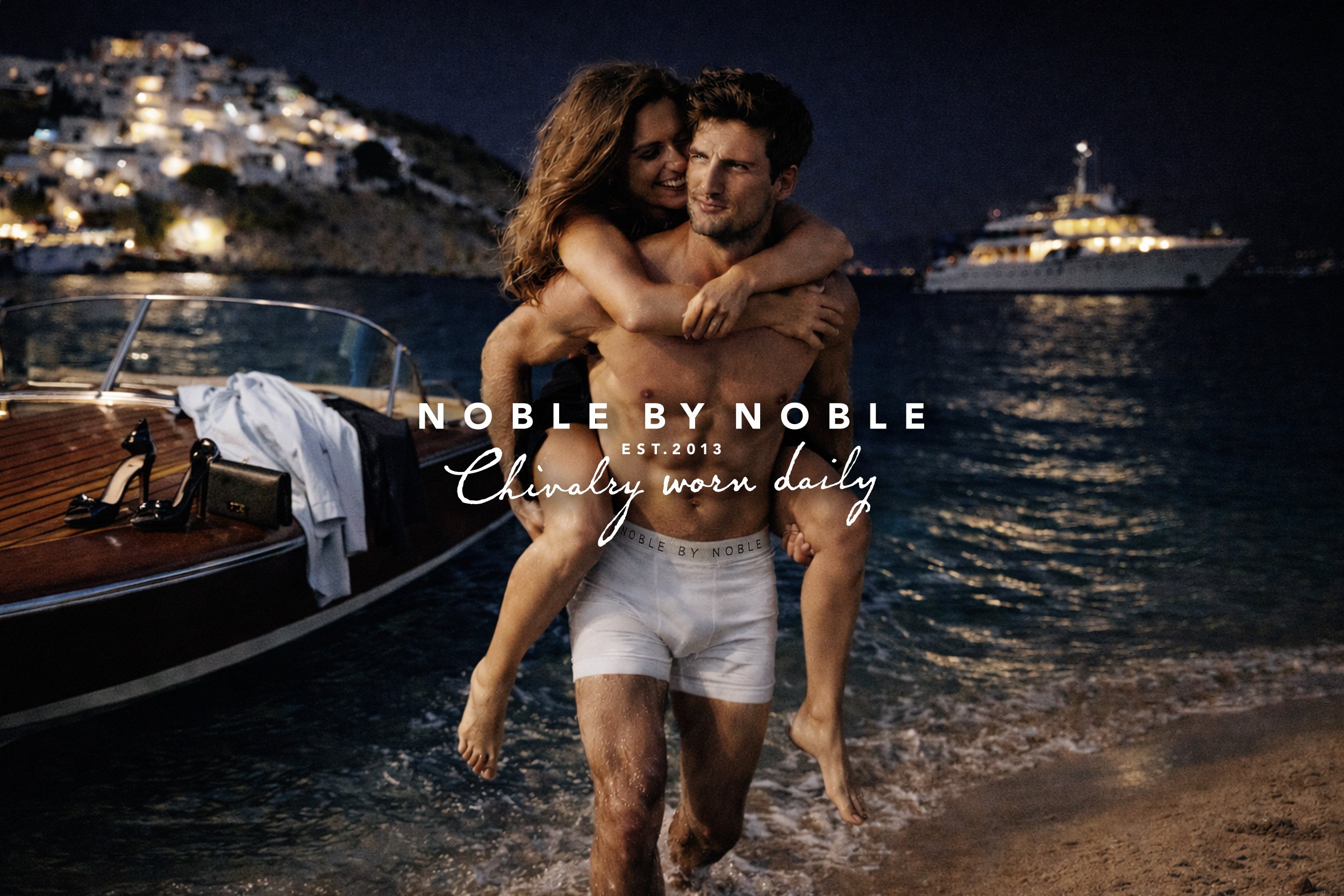
Noble by Noble is a luxury men’s underwear brand from Melbourne, Australia, that combines timeless sophistication with modern sensibilities. Designed for the discerning man who values both comfort and style, the brand draws inspiration from Nordic heritage and royal traditions, offering a refined yet accessible approach to everyday essentials.
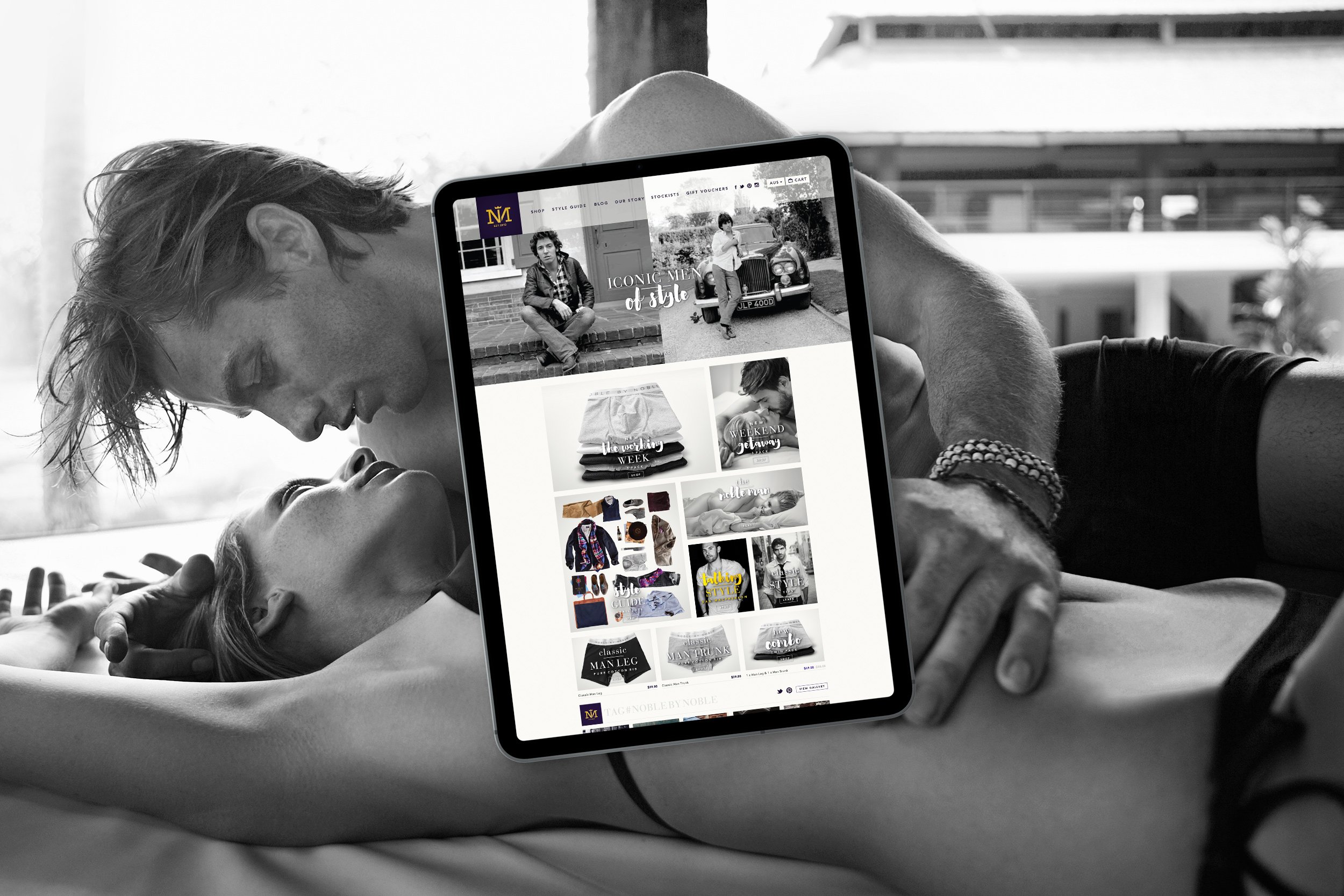
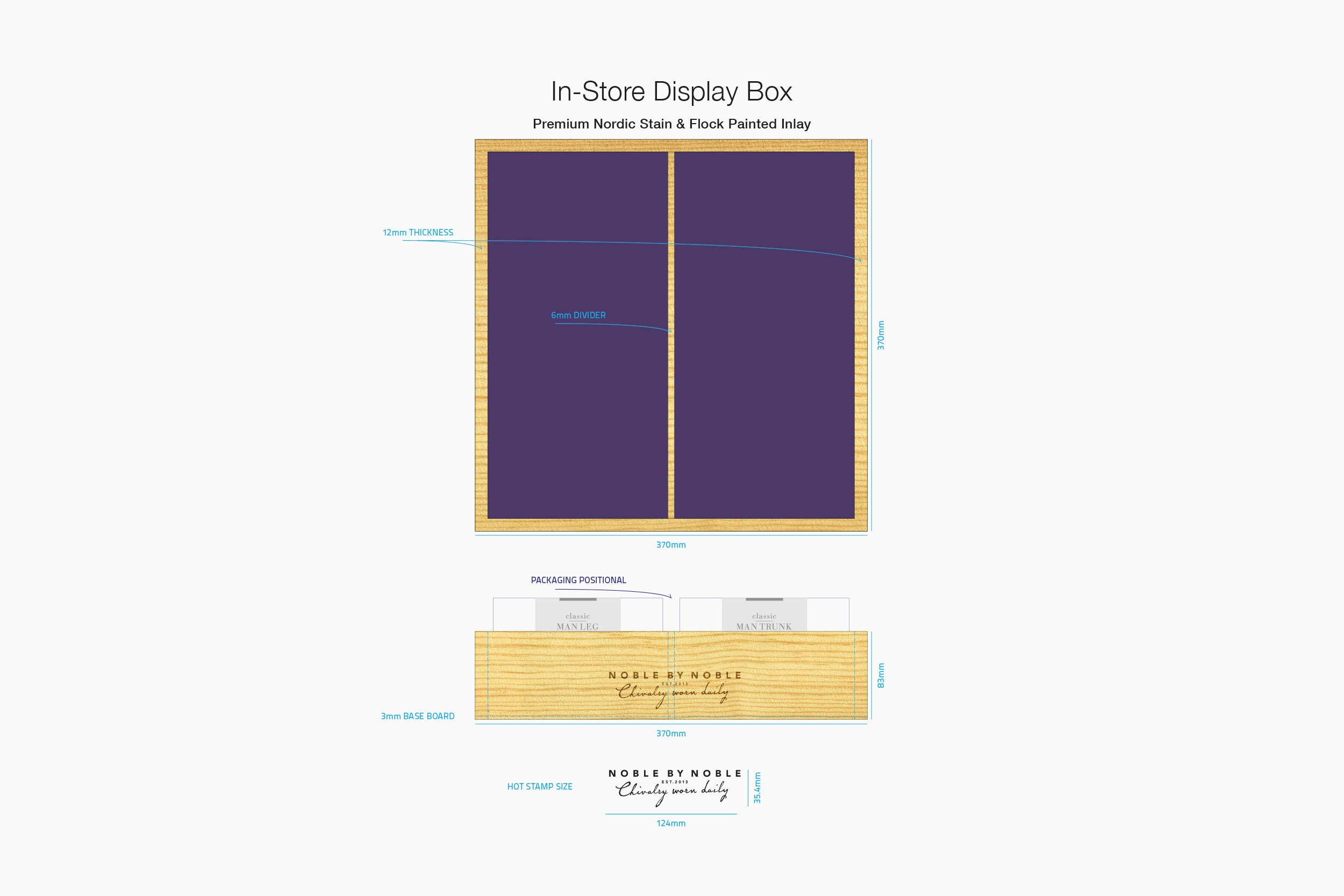
Brief • The goal was to rebrand and reposition Noble by Noble, a boutique men’s underwear company, with a focus on building a comprehensive brand strategy. This involved creating a new logo, product designs, packaging, website, advertising, exterior and interior signage, stationery, and social media marketing to support a fresh, sophisticated market presence.
Target Audience:
• Men, 25-45 years old
• Lifestyle: Busy, active professionals who value self-care and attention to detail
• Values: Quality, craftsmanship, timeless style, authenticity, and practicality
• Income Level: Middle to upper-middle class, willing to invest in premium products
• Personality: Refined, confident, intelligent, with a balance of tradition and modernity
• Buying Habits: Prefers online shopping with a high-quality in-store experience; values brands with a compelling story and consistent experience
• Desires: Luxurious, functional essentials that enhance everyday life and reflect personal values of excellence and sophistication
Solution • To create a timeless and iconic identity, we focused on blending classic design with subtle, contemporary influences. Drawing inspiration from Nordic heritage and royal symbolism, we developed a logo that used the letter “N” in a distinctive and clever way: one “N” was reversed to reflect the brand name, Noble by Noble, while also visually forming the “N” and “M” of the word nobleman – the ideal customer.
The design was not just about aesthetics but about evoking a sense of elevated sophistication, tying the brand to a noble tradition, while still making it feel modern and wearable. To reinforce this concept, we crafted the tagline “Chivalry worn daily.” It functions as both a literal message and a point of distinction, signaling that each piece of underwear is not only luxurious but also speaks to a sense of refined everyday behavior—a nod to personal pride and dignity.
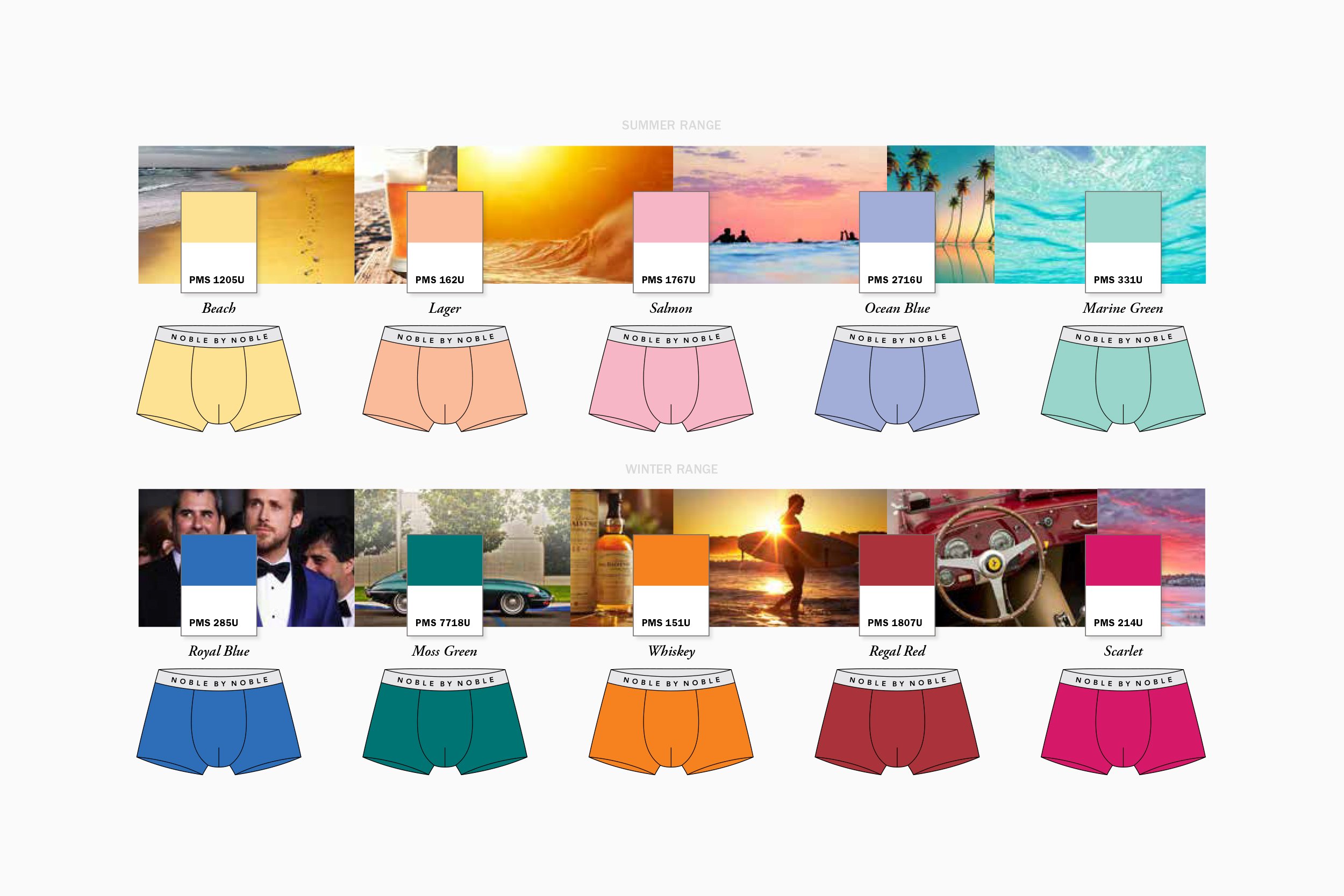
The brand strategy was carefully applied across all touchpoints to ensure a cohesive and sophisticated experience. From product design to packaging, the visual language remained elegant yet accessible. The typography and color palette were chosen to evoke a sense of timeless luxury without feeling overly formal or exclusive. Social media marketing and website design were tailored to engage with a broad audience while reinforcing the idea that style, refinement, and quality can be integrated seamlessly into daily life.
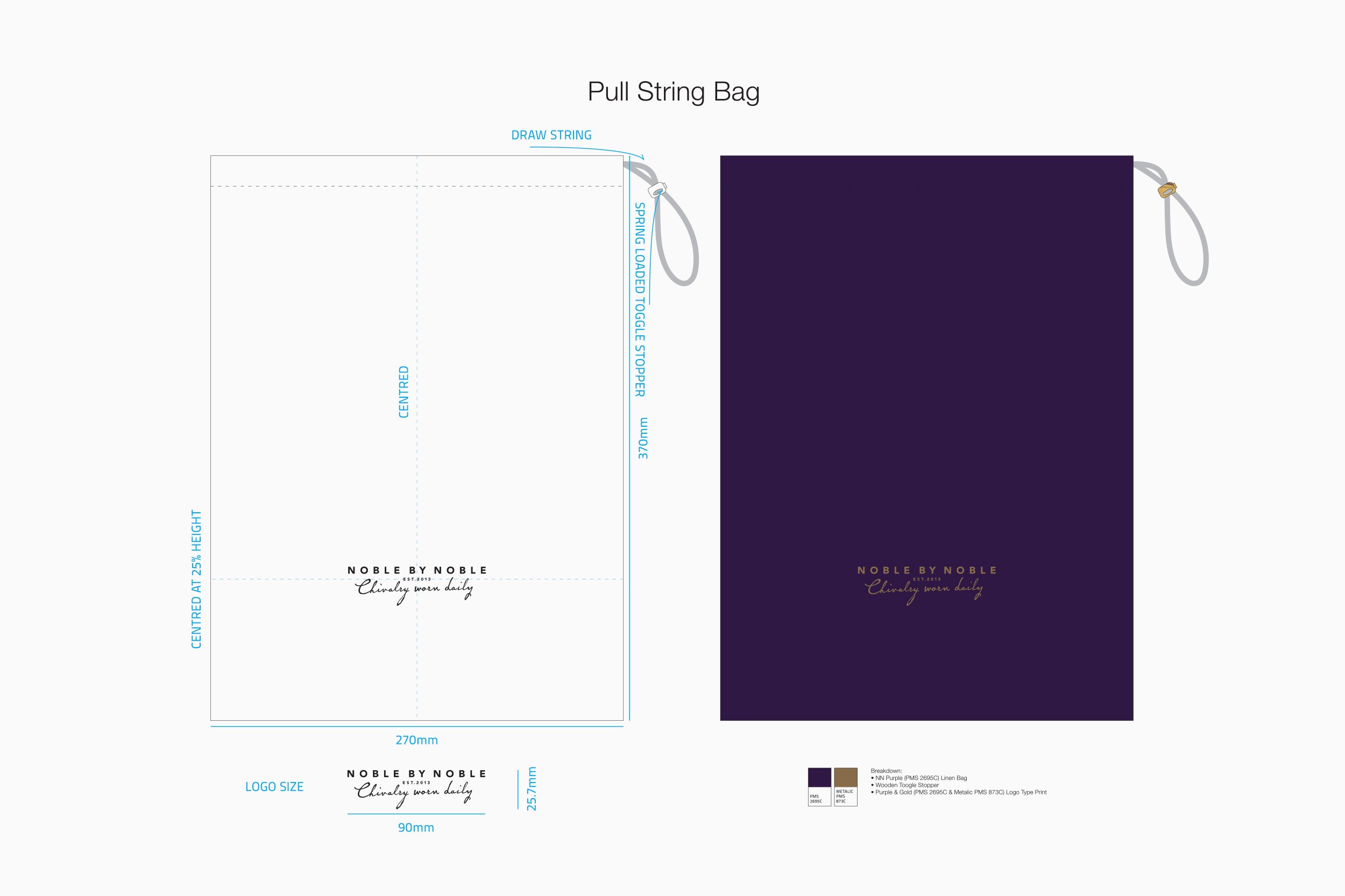
By focusing on every customer interaction – from the moment they see the logo on a store window or online, to the tactile experience of opening the packaging or the application of the logo as an embroidered label on the underwear – we were able to craft a unified brand experience that felt both aspirational and accessible. This holistic approach ensured the brand stood out in a competitive market while resonating with the intended audience in a meaningful and lasting way.